inf-428-data-analytics-online
Assignment 4
Find data that is interesting to you.
Then create 6 different visualizations using 6 different techniques.
Compile your visualizations into a word or powerpoint presentation. Tell a story with your visualizations, for example try to prove who is the best basketball player, or try to show an environmental issue we should be aware of, or convince us what is the next big business we should invest in… the possibilities are endless and should be customized to your interests.
- At least 1 visualization should be in KNIME and one in IPython but you do not have to do a 50/50 split. (Meaning 1 could be in KNIME and 5 in Python, or 3 and 3, or 5 and 1).
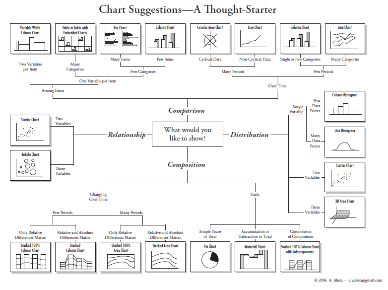
- Possible techniques include bar graph, pie graph, line chart, scatter plot, bubble plot, stacked line chart, etc.
See below figure for chart suggestions…